In our first set of posts here, we explore the possibility of using historical traffic data to train a machine learning algorithm capable of predicting near-term highway conditions — say, up to an hour into the future, at any given time. To try our hand at this, we will be working with publicly available data provided by the California Performance Measurement System (PEMS).
The data provided by PEMS takes the form of time-averaged speed measurements for a large set of points throughout the California highway system (\(\gtrsim 2000\) in the Bay Area alone). These speeds are measured using devices called “inductive-loop detectors\(^1\)” that are embedded just below the pavement at each site of interest. The same sort of devices are used at traffic lights to detect waiting vehicles: If you have ever noticed what looks like a circular or rectangular cut in the concrete at a traffic light, that’s what that is — informative youtube video on how bikers might more easily trigger these.
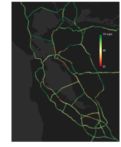
As we dissect the traffic data, we will require a visualization tool. We have developed a tool to do this from scratch in Python\(^2\). This tool plots by color the speed of traffic along each highway. The figure above provides an example (traffic conditions for Jan 15 2014 at 5:30 pm) on top of a silhouette background of the Bay Area (courtesy of Lester Lee).
Stay tuned for updates on this and other related projects!
[1] Aside on inductive loop detectors: Inductive detectors are essentially large wire loops (solenoids) that are constantly being driven by an alternating current source. When a large metallic object (car) is above the loop, the voltage needed to drive the current changes (see below). This effect allows the loops to infer vehicle proximity. In order to estimate speeds, average vehicle-loop crossing times are combined with predetermined average vehicle lengths. [To see why the voltage across a loop changes as a car passes, you can play with these equations: \( V = L \partial_t I\), \(\Phi = L I\), \(\nabla \times \textbf{E} = - \partial_t \textbf{B}\), \(\nabla \times \textbf{H} = \textbf{J}_f\). See also link.
[2] Aside on plotting algorithm: Traffic data on the PEMS website is provided via downloadable text files (1 file per day). Each file provides average traffic speed data, for each five minute window period in a day, for each functioning detector. The detectors themselves are identified with a 6-digit ID number. The latitude and longitude of these detectors, as well as which highway they are on, the direction of the highway, and their absolute mile marker position, are located in separate meta data files. We simply plot a line between each adjacent pair of detectors on a given highway, with color determined by the average speed of the two. North-South / East-West highway counterparts are separated by a small space by shifting their position perpendicular to the local highway tangent vector at each point. Missing data is imputed via the value of the nearest functional detector.
 Dustin got a B.S in Engineering Physics from the Colorado School of Mines (Golden, CO) before moving to UC Santa Barbara for graduate school. There he became interested in Soft Condensed Matter Physics and Polymer Physics, studying the interaction between single DNA molecules and salt ions. After a brief postdoc at UC San Diego studying the physics of bacterial growth, Dustin decided to move into the data science business for good - he is now a Quantitative Analyst at Google in Mountain View.